
Let's make
something
Let's make
something
wonderful.
exceptional.
outstanding.
wonderful.
wonderful.
exceptional.
outstanding.
wonderful.
Get in touch!
Get in touch!
Tab
Introduction
Tab is a startup revolutionizing how independent tourism businesses discover, plan, and book their business offerings, through a seamless and joyful experience. The key elements in achieving this goal is ensuring that travelers can easily and securely book activities or accommodations directly from the websites of independent tourism businesses.
Tab is a startup revolutionizing how independent tourism businesses discover, plan, and book their business offerings, through a seamless and joyful experience. The key elements in achieving this goal is ensuring that travelers can easily and securely book activities or accommodations directly from the websites of independent tourism businesses.
Goals & Objectives
My goal was to redesign a lot of the various things the company offers by focusing on improving both the User Experience as well as the User Interface. This involved further researching on design trends, user needs, their current pain points and problems and finding solutions for them.
My goal was to redesign a lot of the various things the company offers by focusing on improving both the User Experience as well as the User Interface. This involved further researching on design trends, user needs, their current pain points and problems and finding solutions for them.
Component 1
Widget Button
Original Design
The original payment button on our users' websites was a simple green button with the text "Book Now." While functional, it lacked visual cues that could enhance user trust and understanding of its purpose.
The original payment button on our users' websites was a simple green button with the text "Book Now." While functional, it lacked visual cues that could enhance user trust and understanding of its purpose.
Redesign Objectives
Improve User Trust:
Enhance the button to instill confidence in users regarding the security of their transactions.
Clarify Functionality:
Make it clear that clicking the button will open a widget for booking.
Encourage Interaction:
Increase the likelihood of users clicking the button by making it visually appealing and informative.
Redesign Implementation
Redesign Implementation
Added Arrow Icon:
An arrow icon was added to the button to indicate that it opens a new interface or widget, making its functionality immediately clear.
Security Logos:
Incorporating the Mastercard, Visa, and Amex logos provided instant recognition and assurance of secure payment processing, which is crucial for user trust.
Refined Aesthetics:
The button's design was subtly refined to be more visually appealing and aligned with modern UI standards, while maintaining its green color for continuity and recognizability.
Results
Increased Trust:
The inclusion of payment method logos has visibly increased user trust, as evidenced by a reduction in booking abandonment rates.
Enhanced Clarity:
The arrow icon has clarified the button's purpose, leading to a higher click-through rate.
Positive Feedback:
Feedback from both users and business owners has been overwhelmingly positive, noting the button's improved functionality and aesthetic appeal.
Conclusion
The redesigned payment button on Tab's customer’s websites has successfully met our objectives of improving user trust, clarifying functionality, and encouraging interaction. This seemingly small change has made a significant impact on the user experience, reinforcing Tab’s commitment to making travel planning a delightful and secure process.
Component 2
Payment Screen
Original Design
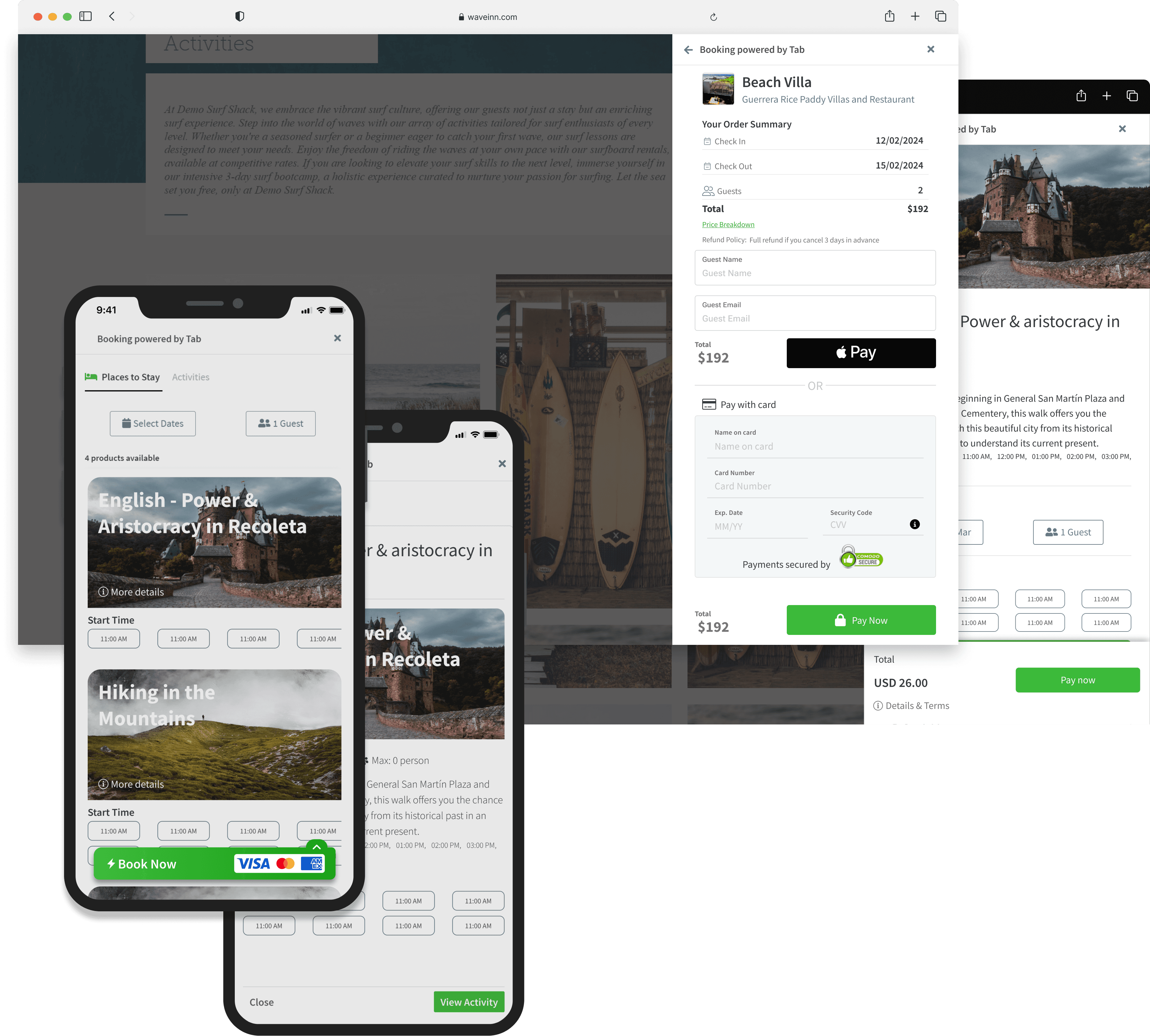
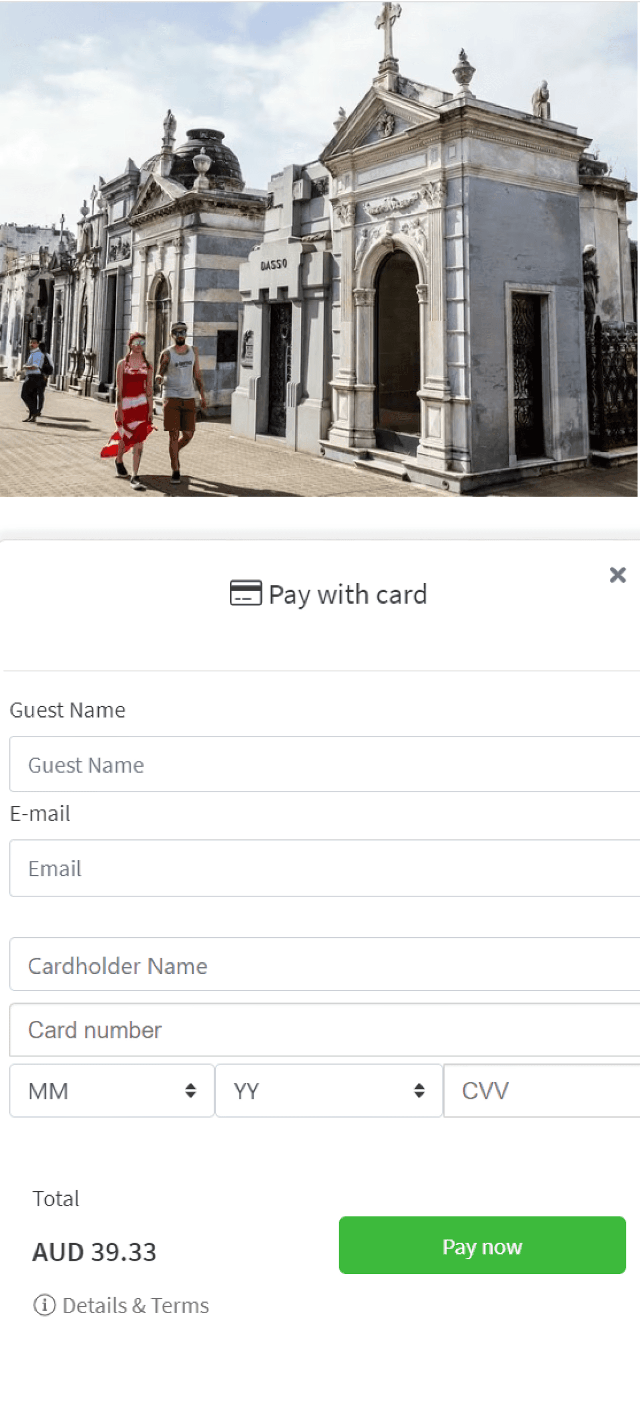
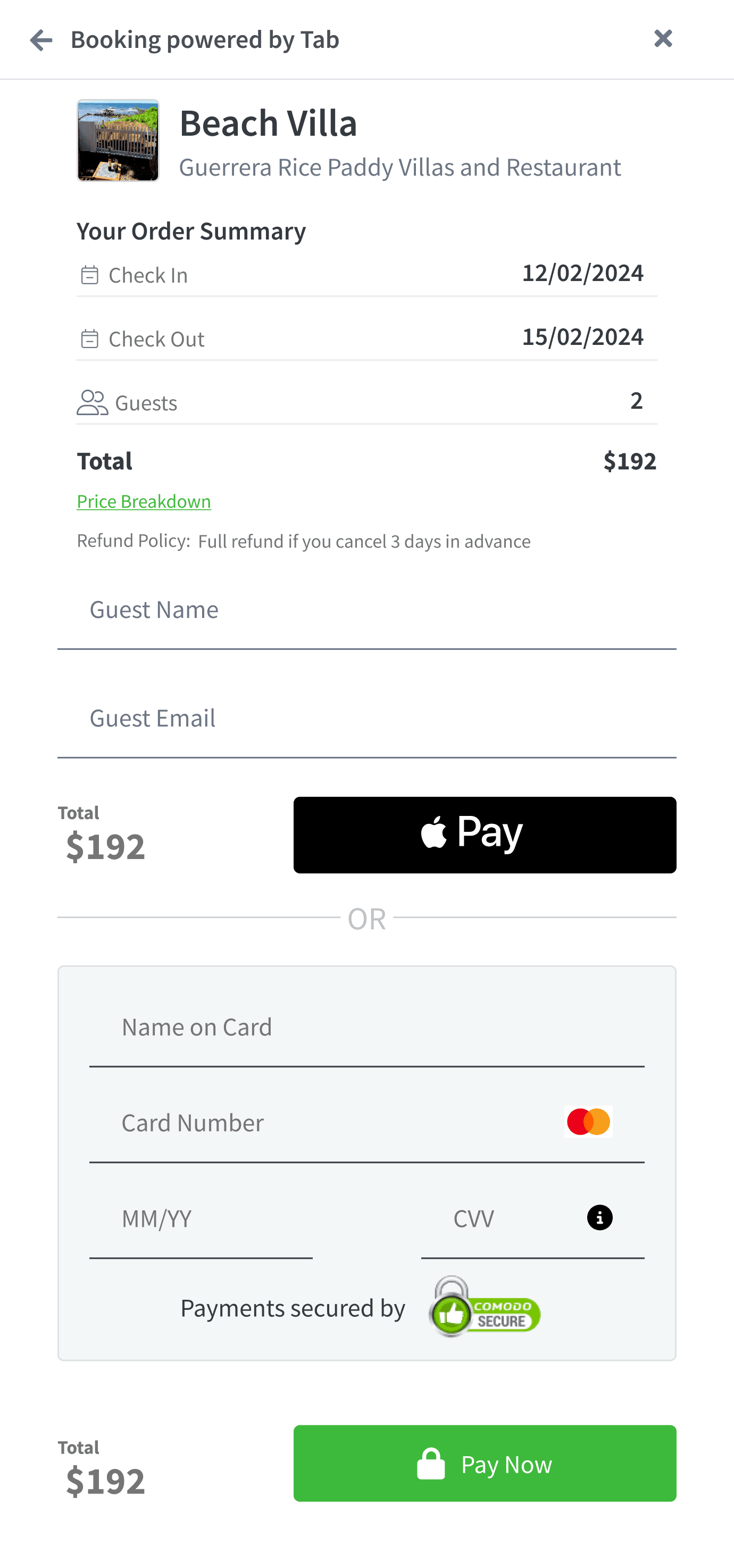
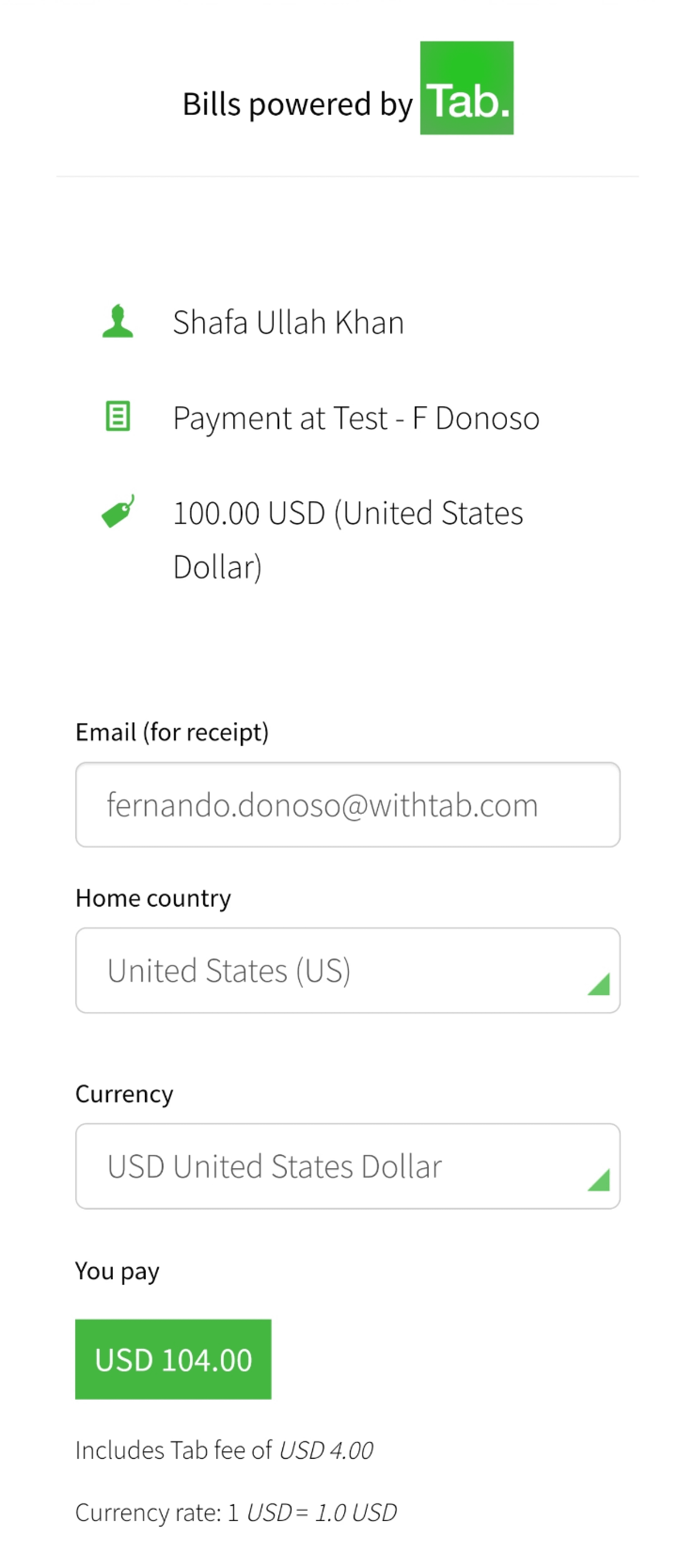
The original payment screen had a poor UI with minimum details about the order, leading to confusion and a lack of trust among users.
The original payment screen had a poor UI with minimum details about the order, leading to confusion and a lack of trust among users.
Redesign Objectives
Improve Clarity:
Ensure users have access to clear and detailed order information.
Enhance UI:
Develop a visually appealing and user-friendly interface.
Boost Trust:
Make users feel confident and informed during the payment process.
Improve Clarity:
Ensure users have access to clear and detailed order information.
Enhance UI:
Develop a visually appealing and user-friendly interface.
Boost Trust:
Make users feel confident and informed during the payment process.
Redesign Implementation
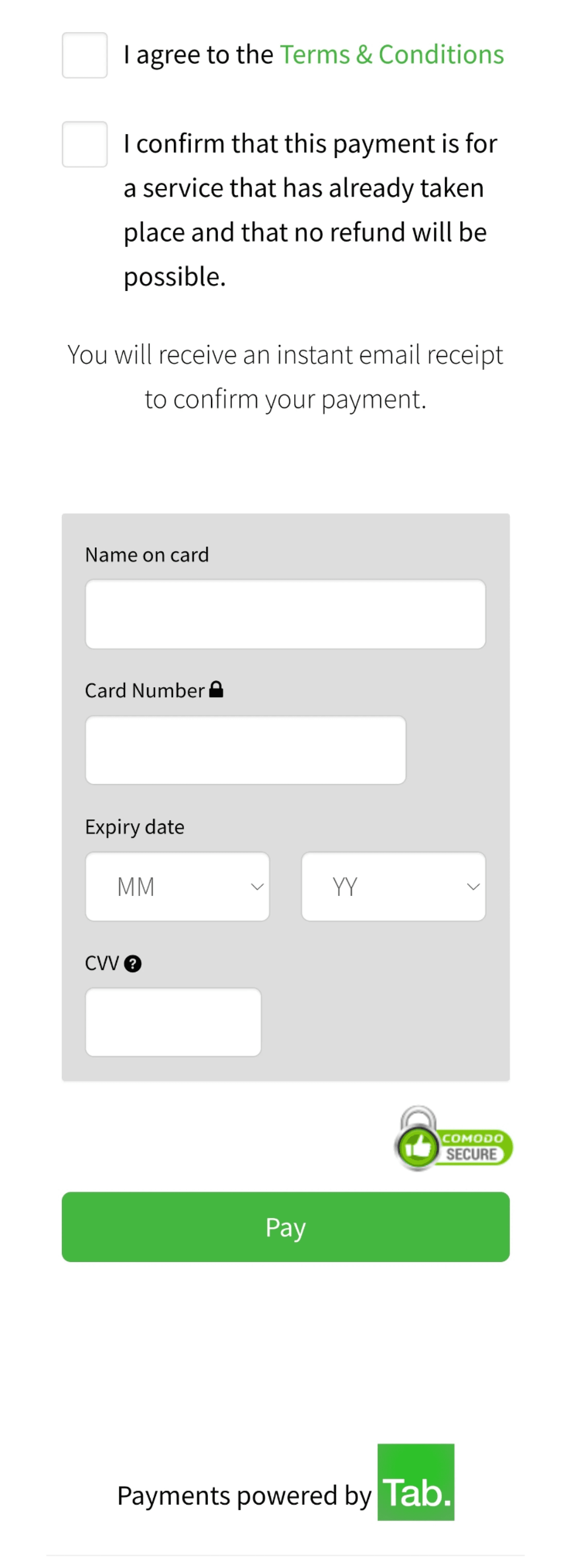
Order Details:
Introduced a comprehensive breakdown of the order, including itemized lists, prices, taxes, and totals. Each element is clearly labeled to prevent any confusion.
Improved UI:
Created a more intuitive and visually appealing interface. This included a clean layout with ample white space, easy navigation, and consistent styling. Key information is highlighted to draw attention to important details.
Security Indicators:
Added security icons (e.g., padlock symbols) and reassuring messages (e.g., "Secure Payment") to enhance user confidence in the safety of their transactions.
Results
Increased Clarity:
Users now have a clear understanding of their order details, significantly reducing confusion and errors.
Enhanced User Experience:
The new UI is more intuitive and visually appealing, providing a smoother and more enjoyable payment process.
Higher Trust:
Users feel more confident in completing their transactions, leading to a noticeable decrease in payment abandonment rates.
Conclusion
The redesigned payment screen has greatly improved user clarity, enhanced the overall UI, and boosted trust in the payment process. These changes contribute to a more seamless and secure travel booking experience, aligning with Tab's mission to revolutionize the way travelers discover, plan, and book their trips.
The redesigned payment screen has greatly improved user clarity, enhanced the overall UI, and boosted trust in the payment process. These changes contribute to a more seamless and secure travel booking experience, aligning with Tab's mission to revolutionize the way travelers discover, plan, and book their trips.
Component 3
Business Payment
Original Design
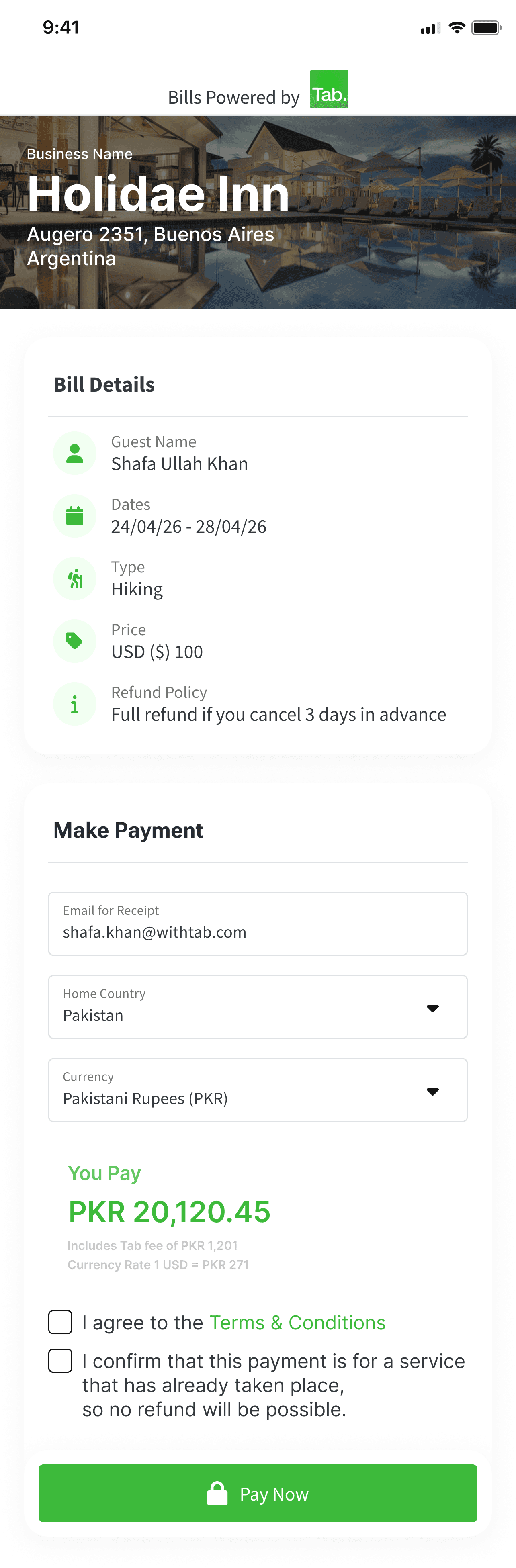
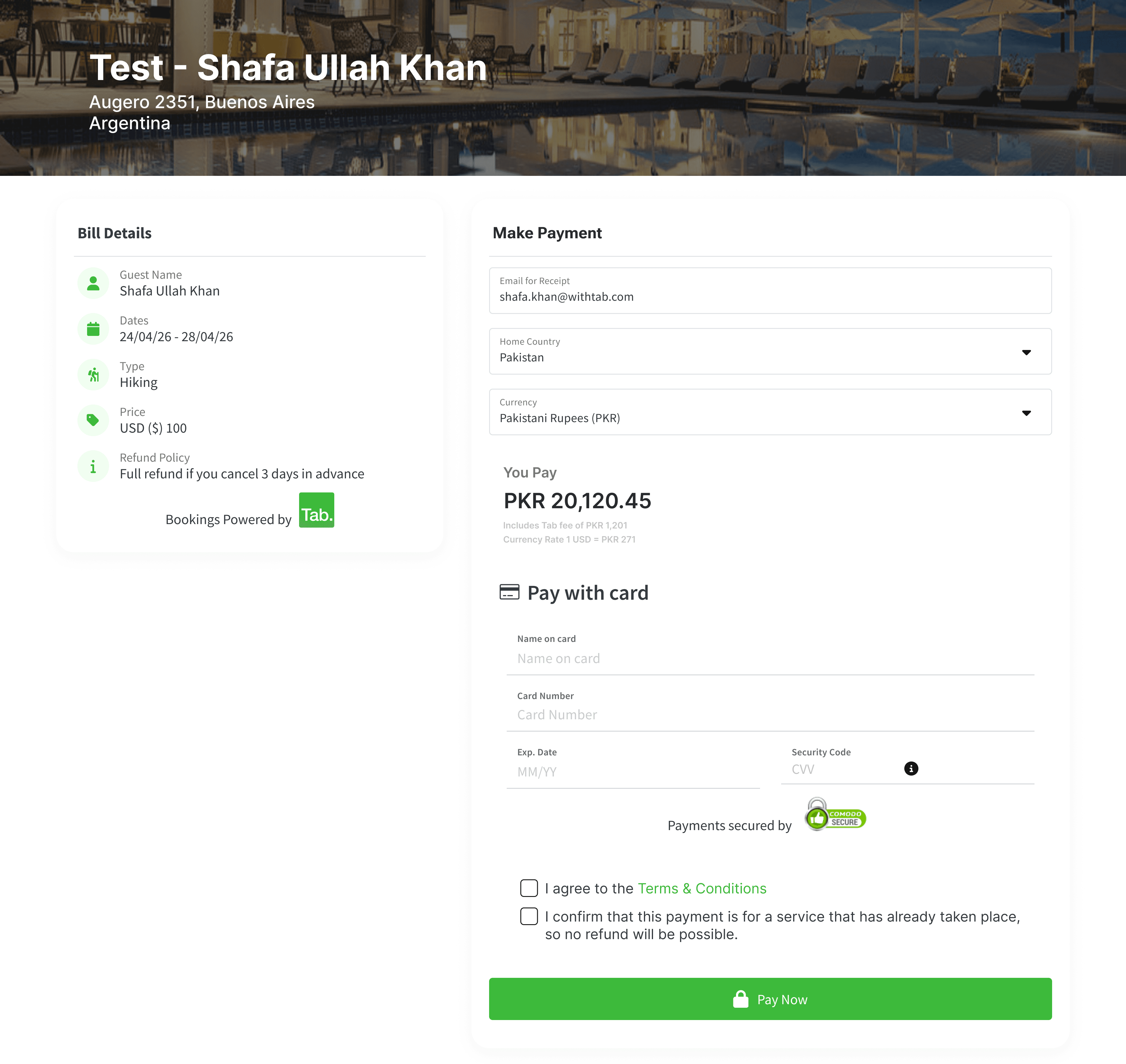
The original business payment screen was cluttered and had a poor UI, making it difficult for users to navigate and understand their payment information.
The original business payment screen was cluttered and had a poor UI, making it difficult for users to navigate and understand their payment information.
Redesign Objectives
Improve Clarity:
Make the payment details clear and easy to understand.
Enhance UI:
Develop a cleaner, more organized, and visually appealing interface.
Highlight Key Information:
Ensure that critical information is easily noticeable.
Improve Clarity:
Make the payment details clear and easy to understand.
Enhance UI:
Develop a cleaner, more organized, and visually appealing interface.
Highlight Key Information:
Ensure that critical information is easily noticeable.
Redesign Implementation
Clear Layout:
Streamlined the layout to reduce clutter, using clear sections for different pieces of information such as invoice details, due dates, and payment options.
Key Information:
Emphasized important details such as total amount due, due dates, and payment buttons using bold text and contrasting colors.
Visual Appeal:
Improved the overall aesthetics with a clean and modern design, incorporating consistent styling and ample white space to make the screen more user-friendly.
Results
Increased Clarity:
Users now have a clear and organized view of their payment details, reducing confusion and errors.
Enhanced Focus:
Highlighting key information ensures that users can quickly find and act on the most important details, such as payment due dates and amounts.
Increased Clarity:
Users now have a clear and organized view of their payment details, reducing confusion and errors.
Enhanced Focus:
Highlighting key information ensures that users can quickly find and act on the most important details, such as payment due dates and amounts.
Conclusion
The redesigned business payment screen has significantly improved clarity, enhanced the overall UI, and ensured that critical information is easily accessible. These improvements make the payment process more efficient and user-friendly for businesses, aligning with Tab's mission to revolutionize travel planning and booking.
The redesigned business payment screen has significantly improved clarity, enhanced the overall UI, and ensured that critical information is easily accessible. These improvements make the payment process more efficient and user-friendly for businesses, aligning with Tab's mission to revolutionize travel planning and booking.
Component 4
Business Dashboard
Original Design
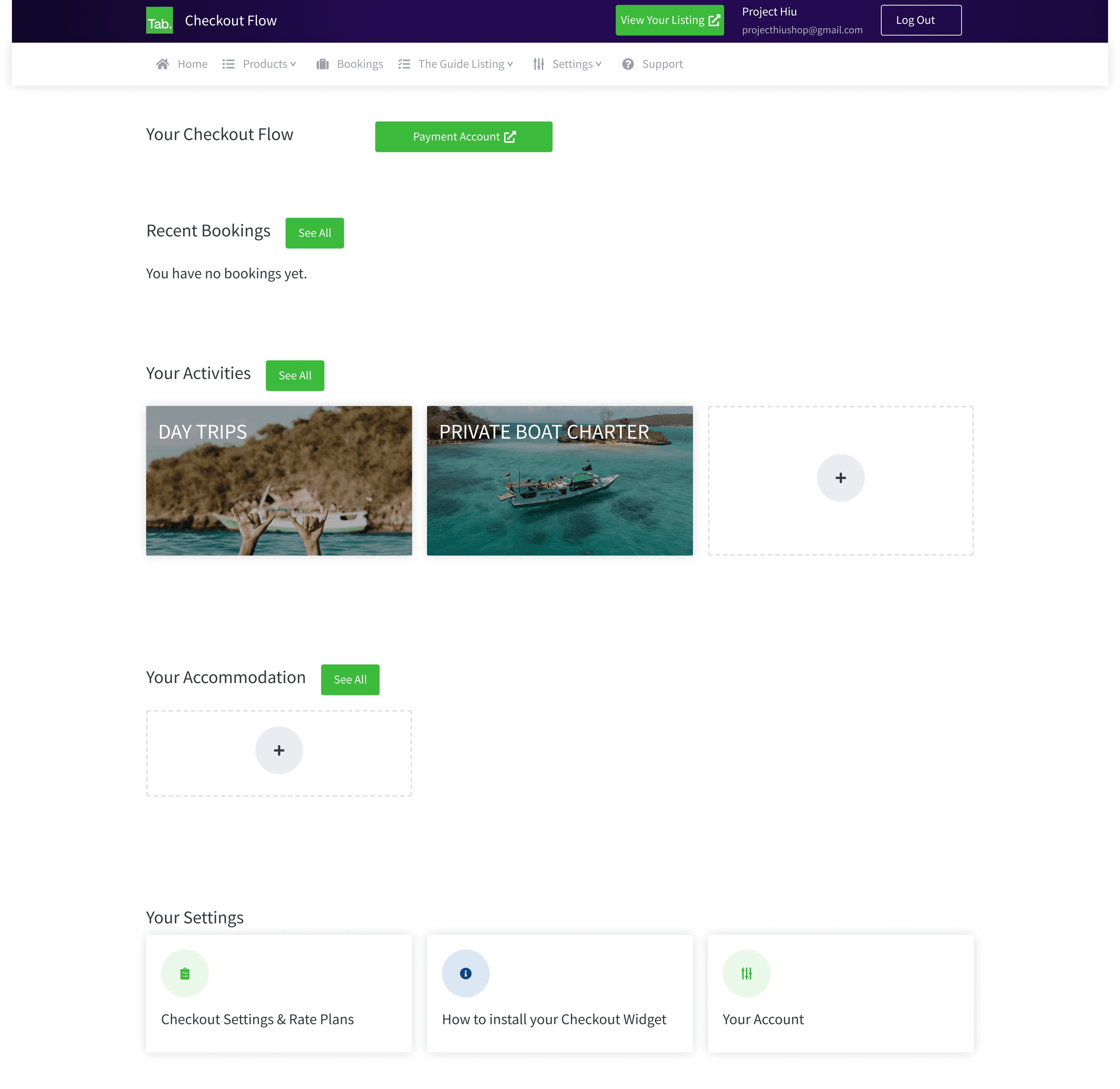
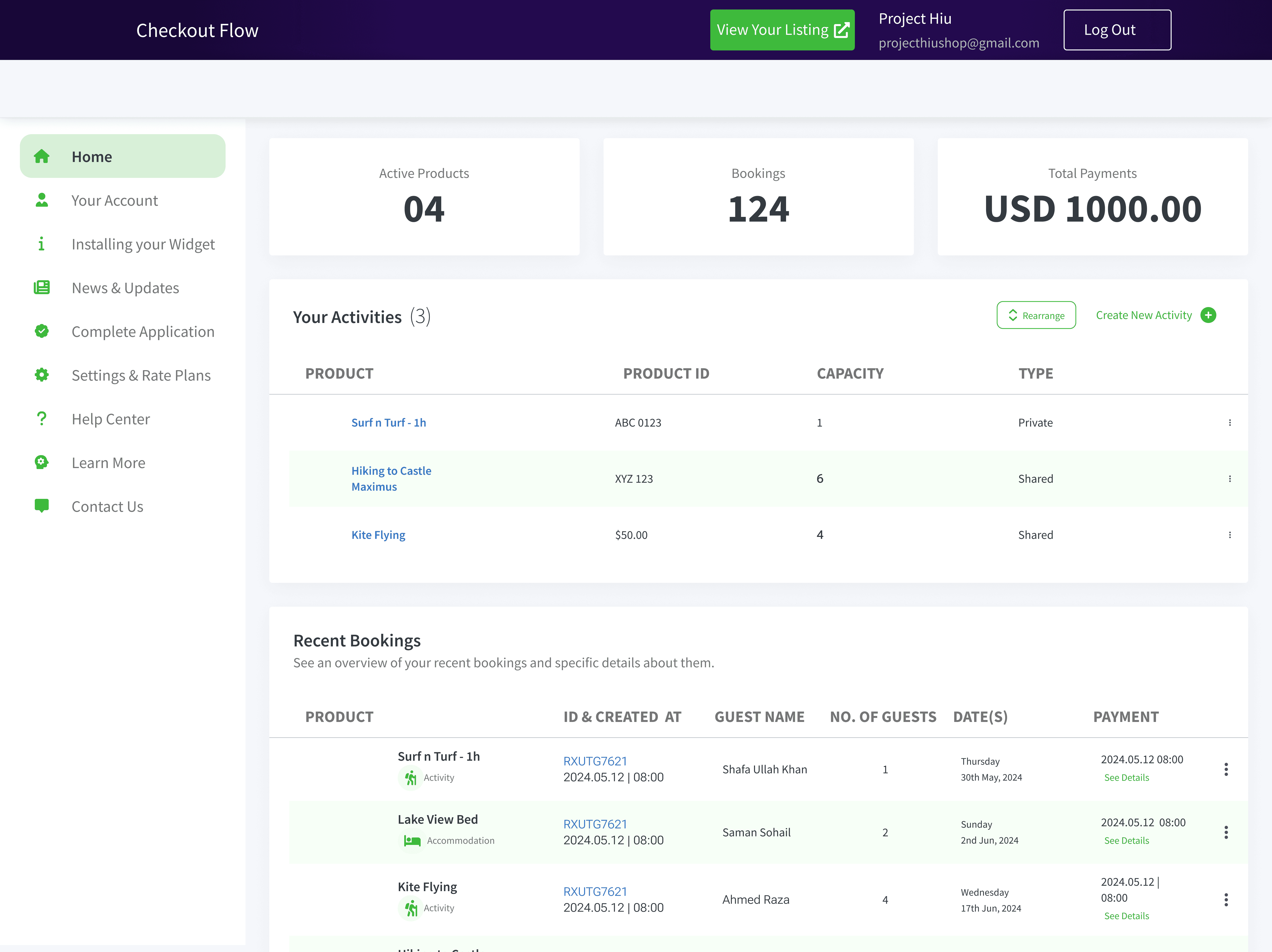
The original business dashboard was disorganized and chaotic, with poor UI and no clear navigation. Information was scattered, making it difficult for users to find and manage their data.
The original business dashboard was disorganized and chaotic, with poor UI and no clear navigation. Information was scattered, making it difficult for users to find and manage their data.
Redesign Objectives
Improve Organization:
Create a well-structured layout that organizes information logically.
Enhance Navigation:
Develop a clear and intuitive navigation system.
Improve UI:
Make the interface visually appealing and user-friendly
Improve Organization:
Create a well-structured layout that organizes information logically.
Enhance Navigation:
Develop a clear and intuitive navigation system.
Improve UI:
Make the interface visually appealing and user-friendly
Redesign Implementation
Structured Layout:
Reorganized the dashboard into clear sections for bookings, payments, and other key information. Each section is clearly labeled and logically arranged to enhance usability.
Intuitive Navigation:
Added a navigation menu with easy-to-access links to different sections of the dashboard. This allows users to quickly find the information they need without confusion.
Enhanced UI:
Improved the visual design with a clean, modern look. Used consistent styling, ample white space, and clear headings to make the dashboard more appealing and easier to use.
Dashboard Widgets:
Introduced interactive widgets for quick access to important data, such as upcoming bookings, recent payments, and alerts. These widgets provide at-a-glance information, reducing the need for extensive searching.
Results
Improved Organization:
The new layout organizes information logically, making it easy for users to find and manage their data.
Enhanced Navigation:
The clear navigation menu allows users to quickly access different sections of the dashboard, improving efficiency.
Improved User Experience:
The enhanced UI and structured layout make the dashboard more user-friendly and visually appealing.
Increased Efficiency:
Users can now manage bookings and payments more effectively, with key information easily accessible.
Conclusion
The redesigned business dashboard has significantly improved organization, navigation, and overall UI. These changes make it easier for businesses to manage their bookings and payments, aligning with Tab's mission to streamline travel planning and booking for everyone involved.
The redesigned business dashboard has significantly improved organization, navigation, and overall UI. These changes make it easier for businesses to manage their bookings and payments, aligning with Tab's mission to streamline travel planning and booking for everyone involved.